 Julian Anderson

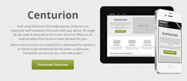
Centurion is a responsive web framework that scales with your device. It built using SASS and CSS3 media queries that help you build sites faster for Desktop and Mobile. No longer do you need to worry about the screen size of an iPhone or an Android tablet since Centurion does the work for you.
The grid adjusts to the screen proportions that are given by the browser, and that is all there is to it.
Built-on CSS3 and HTML5 semantics to allow you to start captializing on a next generation standard. Everything has been scaled to leverage modern media queries, gradients, and other features that give Centurion a unique look and feel with less.
A responsive grid layout makes scaling a web layout for smaller devices a breeze. Take a seat, build your desktop version and watch it scale for your phone instantly. No matter the device: Mac, PC, iPhone, iPad, iPad mini, or Android tablet, Centurion does the work of making your web project responsive and viewable on multiple devices.
Comes integrated with several JavaScript libraries, such as, jQuery, Coffeescript, Craydent and more.
Download: https://github.com/jhough10/centurion
Website: http://jhough10.github.com/Centurion/
License: MIT and GPL License

GIPHY App Key not set. Please check settings