 Julian Anderson

Responsive web design is becoming more and more important now. It is basically a website design that automatically adjusts the layout based on the screen size like desktop, mobile, tablet and other device. Groundwork is a fully responsive HTML5, CSS and Javascript toolkit. Using Groundwork, you can quickly build web apps that work on virtually any device.
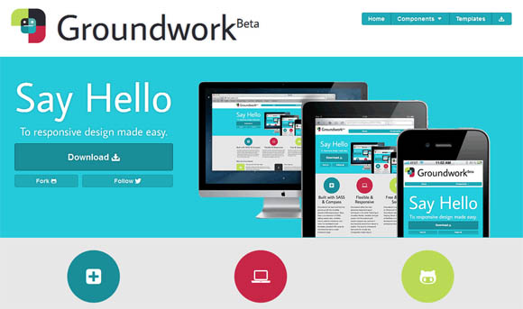
Groundwork has been built from the ground up with the incredibly powerful CSS preprocessor, Sass. Groundwork offers the most advanced responsive layout techniques in the world.
Featuring an incredibly flexible, nestable, fluid grid system: the Groundwork grid system supports any columns in any fractional amount from halves to twelths.
The grid allows you to quickly and easily adapt page layouts for mobile devices as well as the desktop and enables you to build one site that looks great on virtually any device.
Requirements: Sass & Compass
Website: http://groundwork.sidereel.com/home
Download: https://github.com/groundworkcss/groundwork
Demo: http://groundwork.sidereel.com/
License: MIT License


Nice Collection. Add more collections to your library.