 Julian Anderson

skelJS is a lightweight frontend framework for building responsive sites and apps. Consisting of only a tiny single JS file(18 kb), it gives designers and developers access to four powerful components: SS Grid System, Responsive Handler, CSS Shortcuts and Plugin System.
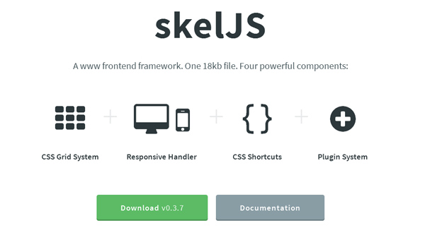
It has a JavaScript-powered and 12-column grid system that can handle any type of complex layouts + has easy-to-understand rules.
A streamlined replacement for CSS media queries designed to handle all of your responsive needs. Simple to configure, built to handle any number of breakpoints, and capable of doing much more than simply shuffle stylesheets.
Handy shortcuts to swiftly deal with all manner of common CSS tasks, like normalizing browser CSS (via normalize.css) and changing the global box model.
A platform for extending skelJS without compromising its lightweight footprint.
Requirements: No Requirements
Website: http://skeljs.org/
Documentation: http://skeljs.org/docs
Download: https://github.com/n33/skelJS
Compatibility: All Major Browsers
License: MIT License
![Color Emotion Guide [Infographic]](https://i0.wp.com/smashfreakz.com/wp-content/uploads/2013/07/color-emotion.jpg?resize=150%2C150&ssl=1)

GIPHY App Key not set. Please check settings