 Elena Simionescu
Much like all other forms of design, web design is a fluid field. That is to say, things change constantly. That’s why there’s such a thing as trends in web design. Predicting the future is no easy task, but if we look carefully at the world around us and the way people are doing design now, we can identify those trends that are now just starting to catch speed.
These trends and the way they grow from one another reflects the ever-changing world around us. As the world changes, so must the trends change in order to keep up and properly reflect the reality we perceive every day.
Now, there’s a lot of articles on this topic floating around the net, but most of them are full of buzz-words, like “fresh” or “crisp”. Be wary of these words, they don’t really mean anything. Every new design is fresh, because it’s just been made. In this article we’ll try to steer away from empty signifiers and look at what’s actually going on in the world of design.
So, let’s take a look at what’s going to be important these next few months, shall we?
Table of Contents
1. Flat is beautiful!

Image source: http://www.webdesignerdepot.com/2013/04/flat-design-sites-that-work/
A year ago, due to the resounding success of the iPhone and the design of the iOS, skeuomorphism was the biggest trend in web design. Skeuomorphism is means design that resembles real-life objects. Like a news app that’s designed to look like a physical newspaper, or an online magazine that has page flip animations in order to give off the feel of a classic, on-paper magazine.
Well, ever since Windows 8 came out, we’ve seen a rise in flat design. That is to say, simple, minimalist design that’s more focused on functionality than on emulation. The look this kind of design has is very attractive, and it’s definitely here to stay, considering that the new iOS7 is a lot flatter than its predecessor.
What does flat design require? Well, simple fill colors rather than complex textures, no shadows or very few shadows and so on. Avoid bevels, embossing or gradients as well as animation. Just look at the Windows 8 Start Screen and you’ll get the hang of it in no time!
This is a great look for online stores and shops. If you’ve got a client who wants you to design their shop, remember that flat design is your friend. The simple fact that the rest of the store is flat will make the products look very good.
2. Contrasting colors!
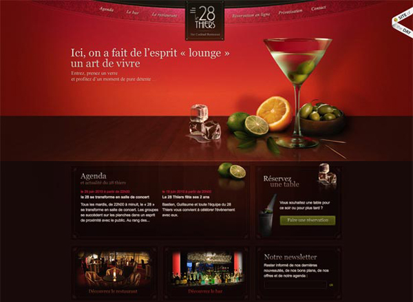
Image source: http://www.webdesignerdepot.com/2010/09/fully-understanding-contrast-in-design/
This kind of ties in to what we were discussing at the previous post. Your color scheme should be powerful, using bright colors with a lot of contrast in between them, but make sure these colors are muted.
Paired with flat icons, these color schemes will create a beautiful visual effect and, properly placed in your website, they’ll create some really beautiful designs. Take care, this type of icon goes especially well when given enough room. Pair it with lots and lots of white space. And speaking of white space…
It’s really hard to think of a kind of website that isn’t right for the application of this trend. Truth be told, be it blog, online store, webzine or any other type of site, contrasting colors is definitely something you can try out and that’ll probably work well.
3. White Space Is Your Friend!
Image source: http://elastique.com.au/category/web-design-blog/inspiration/
You may have noticed that all these points tie into one another. It’s all about flat design, and these are just aspects of flat design that you need to keep in mind. That being said, white space is great. It really showcases minimalist designs and flat design is nothing if not minimalist. More so, pair it with large images and large text in order to catch the eye of the viewer. This type of design looks surprisingly beautiful, especially when paired with the tips we’ve mentioned above.
This one is another non-specific kind of trend. White space and a minimal design works well whenever you’re trying to emphasize the content and really make it stand out. You can use this for web stores, blogs, online magazines, portfolio sites and anything else you can think of.
4. Grids everywhere!
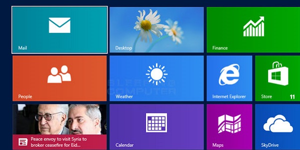
Image source: http://www.bleepingcomputer.com/tutorials/how-to-use-windows-8-start-screen/
We’ve kept using Windows 8 as an example of successful flat design. Well, the most important thing about its design is the way it substitutes the previous start menu with the start screen which as the most important characteristic of all: it’s a grid.
You can count on the fact that you’ll keep seeing websites and apps that separate content in square or rectangular regions of various sizes, usually with a rollover effect.
Grids aren’t for every website. They work best for stores, obviously, but they work equally well for online magazines. What they don’t work so well with is blogs. Usually, when designing a blog, you tend to keep to the classic way of showcasing content on one and up to three columns. Any more than that and it gets confusing for the reader. Still, use grids confidently in most other situations.
5. Responsive Web Design (RWD) Is All the Rage
Image source: http://99designs.com/designer-blog/2013/02/21/web-design-trends-for-2013/
Mobile users are becoming more and more important for most online businesses. More and more of the viewers of any given website are mobile users. This means you, as a designer, have to create designs that work on different screen widths. RWD does just that. That makes it hugely flexible and made it very popular already. It’ll just go on and propagate. The days when you could ignore mobile users are long gone, don’t make that mistake.
There really isn’t any kind of website that should be excepted from using RWD. You should be sure to use it in everything you make: blogs, stores, magazines, presentation websites, corporate sites and any other kind of site – there’s really no excuse for you not to.
BONUS: Parallax Scrolling!
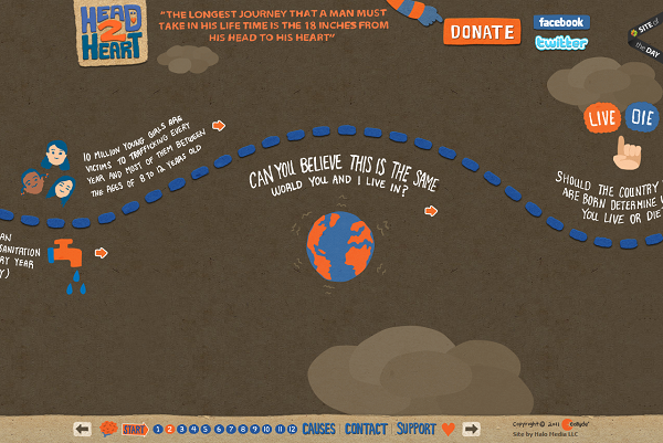
Image 6 source: screencap of http://www.head2heart.us/
Parallax is a displacement in the apparent position of an object when viewed from two different angles. The word is derived from the Greek term parallaxis, meaning alteration. These days, parallax scrolling is all the rage. What does this mean?
It’s a web design technique that features layered images that move with different speeds when scrolling in order to create an interesting 3D illusion. It works really well with most kinds of websites (perhaps not so much with blogs, but it’d be interesting to see it implemented there too), especially with those sites that have some artistic (or just generally beautiful visual) content to showcase- video game site, portfolio, movie website, mobile app website and so on.
That’s it for our predictions of web design trends for this fall. To sum it all up, it’s all about a minimalist, flat kind of design that uses a lot of white space, contrasting colors that are bright but muted, that avoids bevels, embosses, shadows and animations and that has a thing for grids. This kind of design works well with large images and large text as well as parallax scrolling. Furthermore, you need to be careful when designing your site or app to make sure it’s responsive. That is to say, to make sure that your content can be accessed from various devices and from various screen widths.
