 Julian Anderson

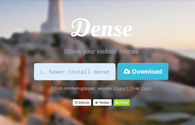
Dense is a jQuery plugin for serving retina-ready, high pixel ratio images with ease. Small, ease-to-adapt, yet very customizable and works cross-browser. It easy way to serve device pixel ratio aware images, bringing in retina support to your website. Clear the blurry, images be crisp.
Dense will run on any modern web browser, and is able to display retina images on browser, device and platform combinations that supports high pixel ratio features. This includes Retina devices with Opera Mobile, Webkit based mobile browsers, like Safari on iOS, and desktop browsers such as Chrome and Safari.
The plugin can be included and invoked by using either browser globals or AMD.


GIPHY App Key not set. Please check settings