Business cards are cards bearing business information about a company or individual. It the most effective ways of promoting yourself and your brand offline. Here, roundup 7 business cards inspiration part 2 are compiled to give inspiration for you to start thinking for your business card design.
See also:
- 60 Photography Business Cards Inspirations
- 30+ Architects Business Cards Inspiration
- 35 Inspiring Red Business Cards
- 40 Inspirational Black Business Cards
- 40 Creative Wooden Business Cards Inspiration
Table of Contents
Business Card for: Essential Patch
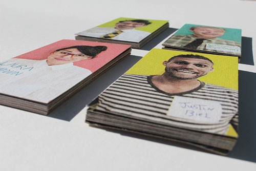
For the Essential Patch team Ratowsky Creative came up with a literally ‘in your face’ business card design. Come with bold, loud colors to match the packaging and scents of the aromatherapy patches themselves while also offering a direct, relatable, humorous connection to the person from the team who passes along his/her card. The cards are printed on a heavyweight kraft paperboard using all natural vegetable inks.

Ayako Okada
Designed a small series of unique popup business cards for hair stylist Ayako Okada. Cards show an illustration of a hair style and when folded in half, a new hair style pops up.
Letterpress Hair Stylist Business Card
This letterpress business card was designed by Elegante Press.
Gravitart
Used Moo’s Printfinity method — which is the option to print different designs on every one — with 352gsm/thick and 100% recycled paper.
Ryan Johnstone Electrician Business Card
This mini business card was designed to be placed on the ends of plugs once they had been Pak tested. It is created from thin cardboard, so to mimic the plug fuse information cards supplied on on devices when they are bought new.
Business Card for: Fat Cow
Fat Cow is a beef-specialty restaurant employing the Japanese way of picking, cooking and serving beef. Drawing inspiration largely from the Japanese aesthetic – Wabi Sabi with traits that include simplicity, economy, austerity, modesty and the appreciation of the ingenuous integrity of natural objects and processes, wood is used primarily as the platform of this brand communication. Note their non-uniformity and texture to suggest the Wabi Sabi beauty of imperfection. The mark and the laser etching on the wood are also reminiscent of the branding of cattle.