 Julian Anderson
Are you want to make responsive website? There are many frameworks kits for creating responsive websites. If you search of a lightweight and focused resource for responsive layouts, here is Responsive Boilerplate.
It is lightweight (3kb) micro-framework, elegant and minimalistic CSS3 grid system, made with only one container and 12 columns.
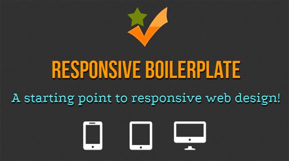
The boilerplate has a single container + a 12-column grid and supports any content with images, video or fluid media with major breakpoints.
It`s very easy to use and understand, pre-packed with some extra css helpers for mobile devices.
Table of Contents
Feature:
Cross Browser.
Adapt to any screen size, including fluid media; images and video and pre-configured with 4 breakpoints, just to make your job easier.
Sublime text Snippets.
Include in the package: PSD Template, HTML5 starting point file for fast development and two Sublime Text snippets for CSS grid and HTML file.
Mobile AeonNav Optimized.
One line of Javascript turns your nav in a beautfull mobile optmized menu. Using HEAD.js to load others libs.
Compatibility: All Major Browsers
License: MIT license
Website: http://responsiveboilerplate.com/
Demo: http://responsiveboilerplate.com/demo.html
Download: https://github.com/newaeonweb/responsiveboilerplate
