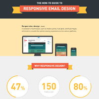
Responsive email design has been growing steadily in popularity, and it’s no surprise as to why: 47% of email opens are on a mobile device, and some brands see upwards of 70% of their emails opened on mobile. These brands turn to responsive design techniques to create better experiences for their subscribers, and in many cases, increase their click and engagement rates.
The foundation of responsive email design is built upon CSS3 media queries, which can be confusing and complicated to learn. And like everything else in email, they don’t work quite the same way in our inboxes as they do on the websites we view in browsers. Enter our how-to guide for responsive email design. See what is possible with responsive email design, how to implement media queries in your design, and support for responsive emails in various mobile email applications.
Source: https://litmus.com/blog/the-how-to-guide-to-responsive-email-design-infographic
See also:
- Structure of a Responsive Mobile Web Design [Infographic]
- How to Grow Your Mobile Presence [Infographic]
- WordPress Goes Mobile [Infographic]
- Should You Build a Mobile App or Mobile Website? [Infographic]


