Many consumers don’t realise that amount of work that goes into designing product packaging when they are selecting their next purchase whilst in the department store. There was once a time where a simple product description along with an image was sufficient but in a highly competitive market, times have changed and print designers need to construct ideas, which aren’t complex but still entice the consumer to buy the product.
As more consumers shop online because of the sheer simplicity the entire process is, businesses are starting to stock more products online which means the vast amount of consumers that shop online have less time to appreciate well designed product packaging, especially when it is covered by a plain brown cardboard box.
Within this article, I’ve found the top packaging designs and have researched the technical aspects behind them, from the design agency that designed them right up to the client and how it was constructed out of their selected materials.
Table of Contents
The Bottle Created from Ocean Plastic

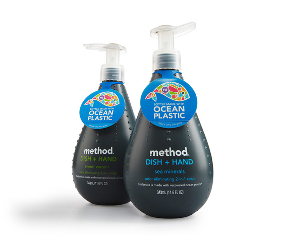
Method, a leading brand in the household cleaning industry in the United States, created the world’s first bottle made with ocean plastic. With an estimated several million tons of plastic making its way into our oceans every year and having devastating effects on the environment, it was in Method’s best interests to help tackle the issue. To do this, they created a unique cleaning product packaged in bottles made from a blend of ocean plastic and recycled plastics.
Origami Tea Bags
NathaliaPronomareva, a Russian product designer, combines the complexity of making a fine cup of green berry tea with the Japanese tradition and art of origami. Even though it’s a concept, it could be created and mass-produced easily as it requires very little extra money to produce.
BANDiful
Bandages are a commonly purchased item and we typically ignore the product packaging they all individually are bought in, usually because it’s too plain to comment on. However, ViviFeng and Yu Ping Chuang have recreated the bandage and the packaging it comes in with BANDiful.
BANDiful takes into consideration that consumers will use bandages arephysically hurt and have designed the packaging around this factor by making the bandages as accessible as possible. The design is minimalistic but has enough decoration to stand out.
Fruit Juice Skins
We are all encouraged to go out of our way to eat more fruit and what better way to obtain your 5 a day but to drink fruit juice. Most of us purchase it in a cardboard carton or plastic bottle but Japanese designer, Naoto Fukasawa, produced Japan’s first fruit constructed packaging. Currently only available in Japan, Fukasawa has produced packaging for fruit drinks out of individual fruit skins, representing the flavour. For instance, a banana skin was used to package banana juice, strawberry skin for strawberry juice and a kiwi skin for kiwi juice.
Music Notes made from headphones
Student Corrine Pant recreated the packaging that these simple headphones came in to engage more people into buying them. By modifying the way they are wrapped and packaged, Pant was able to make each set of headphones, which are available in white or black, into a music note. This bold design makes a huge difference and is therefore more likely to sell.
Parmesan Pencils
German based design agency, KolleRebbe, pride themselves on supporting small manufactures of delicacies, such as cheese. KolleRebbe made quite a small idea into something that many cheese lovers would opt for purchasing simply because of the way it is packaged.
Utilising the shape of a pencil, they designed the cheese to form that shape and included asharpener, which acts as a grater to grate the cheese so you can have as much or as little as you like on your meal.
The Wooden Bee Hive
Designed by Backbone Studio, this all-wood packaging was developed not so much as a novelty but something that becomes part of ones kitchenware. Giving a new spin on the idea of a household honeypot and developed originally as a gift for VIP banking clients in Russia, the response has been significantly positive that a full scale international roll out is in production.
Coffee Bean Glass Bottle
Karim Rashid created the logo, branding and packaging for top quality coffee beverage, Koffy, for Paris Baguette. The logo and branding applied the glass bottle give the beverage the shape and look of a coffee bean.
Tear and Share Storage
When we need to share files on the go, we typically opt for using services like Dropbox. However for those moments when you don’t have Internet access but need to transfer a file between computers, a Kickstarter campaign has been created to help provide a solution.
Made out of 100% post consumer recycled paper, which makes it renewable, biodegradable, lightweight and cheap, Gigs 2 Go, is a credit card sized folio containing 4 1GB USB memory sticks.