News website design has a set of commonly-used features and techniques, like multi-column or grid based layout, bold typography, minimal use of colors but extensive amount of multimedia content. These websites are characterized by heavy and sometimes overburdened structure, but we know some ways to make such theme look more accurate and user-friendly. In this post, we highlight the issues you may face while building a news website, we also give helpfuland useful tips here.
Table of Contents
Question #1: Which Type of Layout is Better for News Website?
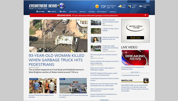
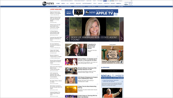
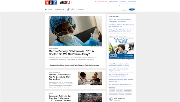
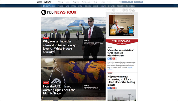
Layout design frames a story and leads users through the website bringing maximum pleasure to them. The more thought-out layout is, the more successful and user-oriented news website is. Grid-based layout is the best possible option to manage a big amount of content. It adjusts to a content-rich website with tons of texts and images, and it looks rather sharp.
There are 4 main types of grid you need to know:
– manuscript;
– column;
– modular;
– hierarchical.
Manuscript grid design should be dismissed immediately. It makes no sense for news website design, because it is usually a single column or a text block integrated on a site and surrounded by margins. Three other variants are worthy consideration and all of them have good features to know about.
The grid can be vertical and horizontal and it may consist of any column number. So, you can use a 2-column grid, but of course it is better to break the content into 3 columns. This helps to make up article categories, facilitate readability and orientate users on specific sections to pay attention. But be cautious about 4-column layouts: it is quite hard to regulate this amount of content columns and don’t get website messy. Plus, you are limited with the typography in this case: you can’t use big fonts but you should in order to keep the page readable.
Modular grid has both horizontal and vertical divisions. This is not a bad way to organize images on a website in order to illustrate news articles. Hierarchical grid is a flexible layout type, so that you can divide website into differently sized columns and sections with various alignment. This solution allows zoning a website together with bringing an original and individual style to it. Hierarchical grid concept reminds us one more thing: the grid can be symmetrical and asymmetrical. Symmetrical content arrangement has a more classic look, while asymmetry adds a bit of creativity on the site making users involved into the process by picking sections to read and following the content trails.
Question #2: Why Sidebar is a Must?
Sidebar fulfills many important functions when on a news website:
– displays headlines: this is a vital part of content organization scheme, because it gives a quick understanding of the whole content mass the website contains;
– makes accents on particular text information;
– includes information vital for reading, but which is not usually described in the main text block. It can be any kind of notice, etc.
– adds more white space by decluttering the layout.
As you see, sidebar plays a significant role for a news website and it is not so difficult to implement this, but before you equip your site with a sidebar:
– make it narrower than the main content columns;
– accentuate it by means of typography;
– keep it in the same color scheme as you do your website;
– pick the right position for a sidebar to correspond with your overall design and enhance its functions on a site.
Question #3: What is a Role of Typography?
The role of typography is truly unvalued. It guides users through a website and sets content hierarchy. News website just can’t exist without a proper content structure and wise visual accents.
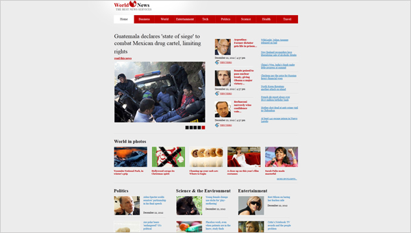
News website design is like a print newspaper version: it has headlines and subheadings. Of course, this needto be emphasized with bigger fonts, preferably in bold. But what are the essential typography factors to take into consideration? Here you have them:
1. Take the typeface selection serious.
How are you going to pick the most suitable fonts for your design? It is not that simple as you think. The appropriate maximum of the fonts’ number is 3, and this includes text titles, casual text, text on banners, etc. In other way, your website will look like a person mixing grunge, hippie and chic dressing styles.
2. Text alignment affects on how the picked typeface looks.
There are four types of text alignment: left, right, center and justified. You’d better avoid justified one, because it deprives you the control over website. The choice should be based on the unique features of the website and the amount of content it is filled with.
3. Typography shapes your website. Use multiple typeface weight variations to differentiate the content.
Question #4: Images Make or Break News Website Design?
Visual content always works better than text. Pictures catch and make readers pay attention on the article (but headlines do this too). That is why images make a news website more successful and worthy reading. But the right question then is where and how to place these images?
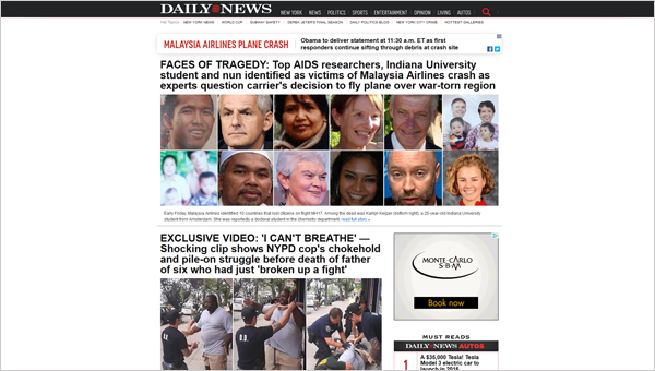
Too much visual content can bring the website design to nothing, so full-screen photos are definitely forbidden. Extremely large pictures are not good for news website, as well. There are two simplest variants to start with: you can use the only picture on the home page for a featured article and add headlines for the rest of the content; or it can be designed like a grid of images each with a small pop-up featuring the heading and maybe a few lines of introduction. These solutions depend directly on the website specification: political news, showbiz news or everything all together.
The pages besides the home page, we mean the article pages, have no strict rules to be designed, so far as this is coordinated by the portion of information you have (with images or without them).
Question #5: Where are Follow/Like/Share Buttons to be Put?
Firstly, it is the home page Header or sidebar above the fold. This is the place for the first response from your readers. You can make a fixed section with social media buttons on the same positions, or in the Footer, so that these buttons are visible through all site. ‘Like’ buttons need to be included on each article page. This allows users to share content and bring you more readers.
Question #6: Email Newsletter – Yes or No?
News website is an informative portal that gives readers tons of articles to read. As a rule, the content on these sites is broken into categories. It quickens and simplifies the users’ search and reading. So maybe it is worthy think about certain category to feature in an email newsletter? When a reader subscribes for this function, give him an option to choose a category (one, a few, all). This can be useful, especially for people who follow just news on political topics, economics, culture, etc.
You would waste your and your readers’ time on including hundreds of articles in the email list, if you don’t make newsletter categorized. Though, you can also send readers just a featured story this day. Something the most important happening in the world may not just interest people, but make them stop on your news portal to get more.
Question #7: Interactive or Static?
More and more designers put interactivity into action when they are creating new sites. Interactive websites are easier to find rather than simple static sites today. But what is the direct benefit you get by turning your site interactive?
Interactivity has a huge impact on the time period that users spend on a site. If they are involved in the process (any), they get excited about what is going further, what they need to do and how everything will turn. Interactive website elements (scroll, page transition effects, etc.) don’t just please users, they increase the amount of information visitors get and so you acquire more chances to raise your conversion rates.
But now, stop and think about the purpose of your news website. Does it have to get people excited? Do they need any actions (besides of basic ones like commenting) to do? You should not seek after fashion and trends, instead you should make your site balanced and user-friendly. News website has to be more static than interactive, though some elements are to be here: comment field, surveys, etc.
Question #8: Should You Go for Responsive?
You must, not should. Responsive design is not an optiontoday, it is one of the primary conditions of a good news website.
Web browsing has increased essentially during last years. There is no a person who has not a smartphone or tablet, or both. That is why, web developers try to make the web browsing more convenient for mobile users: that’s where responsive technology appears.
News website goes as the most demanded website category for mobile browsing. Users want to keep up with latest news constantly: when they stuck in a traffic jam, during lunch or on vacation. Responsive design should be adjustable for all possible screen resolutions of the desktop and all modern devices.
We hope to answer many, if not all, of your questions related to news website design. You definitely have some thoughts on this topic, please share them with us in the comment field!

