There is no doubt about the fact that Apple’s iPhone has emerged as a people’s platform. While the company is able to maintain a healthy app development scenario, there is absolutely every chance for the enthusiast developers to get their app running in the Apple App Store. Believe it or not, but the iPhone OS and most importantly jQTouch, has given web developers reasons to be reckoned with.

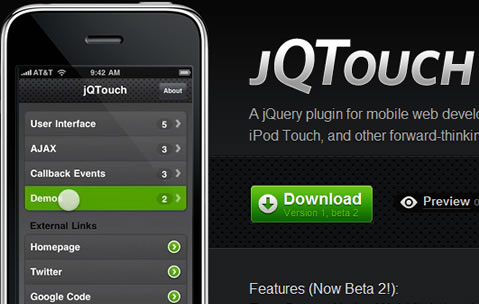
iOS with a unique implementation of jQTouch provides fully-featured web browsing for iOS that responds incredibly with touch-based devices. jQTouch as a jQuery plugin makes the entire process of creating iPhone specific websites easier and faster. JQTouch comes packed with all the relevant tools that make your mobile web look and feel like a native one. It embraces rather than shunning the challenges provided by the mobile environment and that’s what makes it superior and versatile.
In this post, I am going to explain you a complete process of building an iPhone optimized website using jQTouch. The guide is easy to understand and will surely help you in getting your iPhone site up and running. So, let’s get to work!
Table of Contents
Preparing the HTML Structure

jQTouch applications are basically developed in a single HTML file, usually index.html. The file contains all the HTML, JavaScript, and CSS or we can say styling related codes. It’s the only file which is responsible for whatever happens within your application and gets loaded in the Smartphone just like Gmail or any other Google application. To create an HTML structure add the following code inside <head></head>.
<meta name="viewport" content="initial-scale=1,maximum-scale=1,minimum-scale=1 user-scalable=no,width = 320" />
<meta name="viewport" content="width=device-width; initial-scale=1.0; maximum-scale=1.0; user-scalable=0;" />
<meta name="apple-mobile-web-app-capable" content="yes" />
<meta name="apple-mobile-web-app-status-bar-style" content="default" />
Notice how we have used the viewport meta key to revamp the presentation of our content that is to be displayed in Mobile safari. Talking about the ‘initial-scale’, it’s nothing but the scale used to represent the content when the first time it’s being viewed by the visitor. Maximum and minimum scale are the scales that determine the user’s extent to zoom in or out a content. Since, all these values are 1 in our code, so the user is unable to zoom in or out the content which we actually want to achieve. Additionally, observe the use of user-scalable, this is helpful in determining the user’s capability to zoom out/in the content.
Now continuing with the HTML structure, we have created a basic structure or we can say rules for the device, we can now proceed on to develop our iPhone optimized website. At this point, both JavaScript as well as CSS files need to be linked together. For this you can take the reference of the jQTouch stylesheet (full or min) and then link it to the main stylesheet which contains all the basic styles you want your website to be implemented with.
<link rel="stylesheet" href="style/jqtouch/jqtouch.css" type="text/css" media="screen" /></div>
<link rel="stylesheet" href="style/main.css" type="text/css" media="screen" /></div>
After this, it’s time to integrate all the references to the necessary JavaScript files. Also, Using jQTouch you need to link jQuery 1.3.2 min.js and jqtouch.js together. Additionally, create a file namely global.js in your JavaScript directory. Once you are completed with these, the following links will be generated.
<script type="text/javascript" src="style/jqtouch/jquery.1.3.2.min.js"></script></div>
<script type="text/javascript" src="style/jqtouch/jqtouch.js"></script>
<script type="text/javascript" src="style/js/global.js"></script>
This is our header section.
Initializing jQTouch

Now, open your global.js file again and start inserting the following components.
Icon- setting the home screen icon that will be rendered in the application
addGlossTolcon- glossy button effect on the icon
StartupScreen- passing a string path to a 320px420px start up screen for full screen apps
StatusBar- style the status bar when running as a full screen app
PreloadingImages- pass an array of image paths before the pages are loaded completely
var jQT = new $.jQTouch({
icon: 'newjtouch.png',
addGlossToIcon: true,
startupScreen: '1.png',
statusBar: 'black',
preloadImages: []
Content Creation
In this step, we need to create the content which is to be presented on the home page of our web app. Typically, jQTouch treats every top-level div id on our page as its own page of content. So considering the code below, it will take #portfolio as its own page along with the #contacts or whatever we are going to add.
<div id="home" class="home page">
<h2><a href="/" id="logo">JQTouch</a></h2>
<h2>Its a simple page for JQT</h2>
<ul class="links">
<li><a href="#about">About JQT</a></li>
<li><a href="#whentouse">When to use</a></li>
<li><a href="#contact">Contact</a></li>
<!-- #home close -->
</div>
Adding Some Style to Our Content

Now, a few CSS classes can be used that will style our content to match our “Apple” theme. For this, the below mentioned code can be added to our main.css file.
body {
background-color: #e5e5e5;
}
#logo{
background: url('../img/JQT.png') no-repeat;
height: 0;
width: 0;
padding: 200px 0 0 120px;
display: block;
overflow: hidden;
margin: 40px auto;
}
h2{
color: #156565;
font-family: Helvatica, Arial;
font-size: 10px;
font-weight: normal;
letter-spacing: 1px;
line-height: 18px;
margin: 27px 13px;
text-align: center;
text-shadow: 1px 1px 0px #fff;
text-transform: uppercase;
}
#home ul.links{
margin: 0 13px 27px 13px;
}
#home ul.links li{
background: url('../img/type.png') right center no-repeat;
border-bottom: 2px dotted #ababab;
font-family: Helvetica, Arial, sans-serif;
font-size: 10px;
letter-spacing: 1px;
list-style: none;
text-transform: uppercase;
width: 100%;
padding: 18px 0 18px 0;
}
#home ul.links li a{
color: #156565;
font-weight: bold;
text-decoration: none;
padding: 0 80px 0 0;
}
From the code above, you can easily change the background color, style your logo, make opening paragraphs appealing, and so on to make your content stand out.
Creating More Pages for Content
As of now we have created our home page, it’s time to move further to create content for some more pages. For this, the following markup should be added t your HTML file.
<div id="about" class="section">
<div class="sub-section">
<a class="back" href="#home">← back</a>
</div>
<h2>How To Use</h2>
<p>
Add whatever the information you want to display
</p>
<h3>Conntact</h3>
<ul class="details">
<li> Your Name</li>
<li>Address Line 1</li>
<li>Address Line 2</li>
<li>Ph Number</li>
</ul>
</div>
Have you noticed anything different in the code above? If not then let me tell you that there is a toolbar here. This toolbar will remain placed at the top of the website that will allow users to navigate back to the home page.
Styling Your #about
Here what we only need to add some styling effects to our toolbar and content. This is how we can go about it.
#about h3{
color: #156565;
font-family: Helvatica, Arial;
font-size: 10px;
font-weight: normal;
letter-spacing: 1px;
line-height: 18px;
margin: 27px 13px;
text-align: center;
text-shadow: 1px 1px 0px #fff;
text-transform: uppercase;
}
#about .subsection a{
background: black;
color: white;
display: block;
font-family: Helvatica, Arial;
font-size: 10px;
letter-spacing: 1px;
text-decoration: none;
text-transform: uppercase;
padding: 15px 8px;
}
#about ul.details,p{
font-family: Helvetica, Arial, sans-serif;
font-size: 14px;
color: #282829;
line-height: 23px;
margin: 15px;
}
#about a{
color: #156565;
text-decoration: none;
padding: 0 0 10px 0;
border-bottom: 1px dotted #bababa;
display: block;
font-family: times new roman, serif;
font-size: 16px;
}
#about ul.details li{
list-style: none;
padding: 0 0 10px 0;
}
Now, we are done with styling our toolbar and content. We have also styled the p, ui, ul and h3 for our website.
There is absolutely no limit to how many divs one can use in the HTML. However, what is important here is adding link to them. Developing for iPhone isn’t an uphill battle once the actual optimization has been executed.
What’s Next?
Lastly, the following JavaScript can be added at the end of <head></head> section of any website you want to create a mobile optimized version of safari. The code is extremely helpful in determining the iPhone or iPad touch and will send it to the targeted page accordingly.
<script type="text/javascript">
if ((navigator.userAgent.indexOf('iPhone') != -1) || (navigator.userAgent.indexOf('iPod') != -1))
{
document.location = "http://anywebsite.com";
}
</script>
Hopefully, you enjoyed the tutorial and have gained a pretty good understanding on the process of creating a well-optimized iPhone website.

