While Apple continues to innovate to allow its users the best of experience, it is important that apps developers also keep pace, because only then users will actually get the experience they are aspiring for.
With the launch of iOS 7 this September, Apple has introduced some very exciting improvements in terms of the user interface, whilst continuing to create new benchmarks in simplicity and convenience of use. As third-party apps form an important part of the user experience, it is important that the design of these apps are in accordance with the new principles that govern the user interface as laid out in iOS 7.
An understanding of the essential features that defines the transition from iOS 6 to iOS 7 would help app developers steer their developmental efforts in the right direction.
# From Glossy to Flat
The intent behind transitioning from a glossy look to a flat one is to help users focus on the content rather than the aesthetics. The idea behind the move is to not let the design elements compete with the content elements for user attention. Consequently, the new user interface does away with the shine effect, uses softer colors, and has larger icons. The icons now have a uniform style, so much so that even the line width across icons is also consistent. The icon design is simpler too in terms of the number of objects used to communicate the function of the icon.
What it means for app developers is that while they have lesser tools to play with, they still need to bring out what is best for the users. The developers need to understand that the user requirement is very simple – they just want to instantly know what they should be caring about on the screen which is in front of them. So apps developers will now have to manage this objective without the textures, shadows, and other tools. With iOS 7, they can only play with color, contrast and depth to recreate the information hierarchy for users so that they can quickly grasp the information they need.
# Differentiation for Clarity
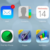
To enable users to differentiate between content and control, the control elements which are interactive have been given a blue color. Along with color, font sizes have also been used to denote the level of relevance and importance of the content. A case in point is the mail application, where the font size depicting the sender name has been made larger to enable easy scanning for users, so that they can instantly locate e-mails they would be looking for. The available actions, subject of the e-mail and the time stamp have been accordingly scaled.
# Bar Buttons – Transparent or Translucent
All bar buttons whether it be navigation bar (for managing information hierarchy or moving across screens, toolbar (for performing actions on objects on the screen or current view) or the search bar button, have been provided a translucent or transparent background which otherwise used to have an opaque background in iOS 6.
The apps developer might face a problem here; when not properly done, users might perceive this to be an error. Hence a bit of experimentation on this front would be required. The translucent screen should be such that it only blurs the content directly behind it—giving the impression of looking through rice paper and it doesn’t blur the rest of the screen. Basically, it should give an impression of transience.
All buttons in iOS 7 are borderless and hence apps developer should try and build their buttons accordingly.
# Leveraging the Whole Screen
To maximize user experience, apps developer can look forward to utilizing the full screen for organizing the content, while the use of insets of visual frames should preferably be eliminated. A case in point is the Weather apps in iOS 7 which now extends over the full screen, and hence is able to carry more information. Besides, it is also able to position the most relevant information at just the right place thereby allowing a user to gather what he is looking for just by having a glance.
While the iOS 7 design is radically different from iOS 6, keeping these things in mind will help you create the right design for your new apps.

