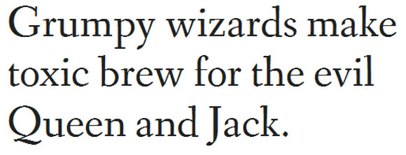
Properly selected typography can convert simple design into an attractive piece of art. Below you’ll find 10 elegant serif google fonts that suitable for for headlines. These serif fonts available in the Google font library. Download them and test driveon your design.
See also:
- Simple and Minimalist Film Posters by Matt Owen
- Minimalist Beatles Music Posters by Matt Chase
- 23 Jazz Music Festival Posters Inspiration
- 25 Creative Office Workspaces Design Inspirations
- Packaging Design Inspiration by Anderson Design Group
Table of Contents
1. Trocchi
Trocchi is a design derived from a number of old faces from the English typecutter Vincent Figgins (1766-1844) including Nebiolo’s ‘Egiziano’, and Caslon & Co’s ‘Antique No.4′ and ‘Ionic No.2′. Trocchi derivates from these earlier designs to produce a more casual slab serif. Trocchi is designed for use both as text and display type.
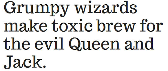
2. Antic Didone
Antic Didone was designed for use in the headlines of newspapers and magazines. The Antic Type System is a super family that is still evolving, and this first release of the Didone family. It complements the Sans and Didone versions, giving the designer freedom to create rhythmic and dynamic typography using all three families in the type system.
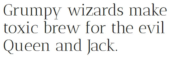
3. Ovo
Ovo was inspired by a set of hand lettered caps seen in a 1930’s lettering guide. The capitals suggested the time in which they were made because of the soft serif treatment used. This detail and a subtle casual feeling creeping into the otherwise classical forms led to the soft genial lowercase and the whimsical numbers now seen in Ovo.

4. Antic Slab
Antic Slab was designed for use in the headlines of newspapers and magazines. The Antic Type System is a super family that is still evolving, and this first release of the Slab family. It complements the Sans and Didone versions, giving the designer freedom to create rhythmic and dynamic typography using all three families in the type system.

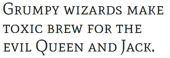
5. Mate SC
This is the Small Caps (SC) style, featuring traditional proportions, completes this initial release with its medium height numbers in all styles. The primary use for the family is in text, yet due to the constructive details of letterforms, this family can be used in larger sizes for display typography.
6. Crete Round
Crete Round is a warm slab serif providing a hint of softness to texts. It started as a tailored version of the original Crete fonts, created specially to serve as corporate typeface for the type design competition Letter2. Crete Round is more independent from the original with modified terminals and serifs to create two new fonts that deliver a more contemporary and functional appearance.

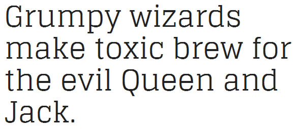
7. Glegoo
Glegoo, a truly modern slab serif. This Regular style is the first of what will be a large typeface family. It has a precise balance of shapes, counterforms and strokes. Glegoo is slightly condensed, has a large x-height, short ascenders/descenders and large counterforms.
8. Fjord One
Fjord is a serif typeface, originally designed with printed books in mind, and particularly intended for long texts in small print sizes. Fjord features sturdy construction, prominent serifs, low-contrast modulation and long elegant ascenders and descenders relative to the ‘x’ height.
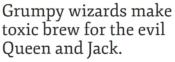
9. Amethysta
Amethysta was designed by Konstantin Vinogradov with the purpose of printing on low quality paper in mind. This is why it has such minimalistic wedge serifs and terminals. It builds the impression of a simple and strong text typeface. In terms of proportions it is closely related to the transitional serif group.
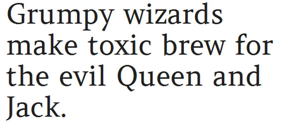
10. Fanwood Text
Based on Fairfield, the typeface first published in 1940 and designed by Rudolph Ruzicka, a famous Czech-American type designer. Fanwood Text roman and italic are the same as Fanwood, but slightly darker and reduced in contrast; this was tailored for increased readability on the Amazon Kindle 3 e-book reader hardware.
