 Julian Anderson

Websites built today must be mobile friendly. Why have two different sites for mobile and desktop when you can have your main site be one size fits all? Responsive web design not about making sites for mobile devices, it’s about adapting layouts to viewport sizes.
Many people are trying to create responsive web design. If you are new to responsive design approach then you must start building your first responsive design using one of these frameworks. In this post we roundups 10 best responsive grid framework for web design. enjoy it !!
See also:
Table of Contents
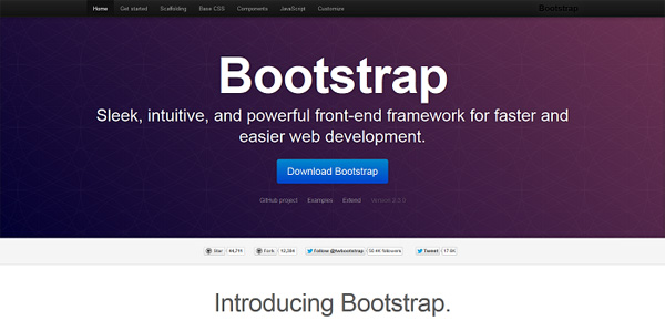
Bootstrap
Most poular responsive framework. Sleek, intuitive, and powerful front-end framework for faster and easier web development.
BluCSS
BluCSS is a CSS framework designed with ease of use and simplicity in mind. It is specifically made so that when you’re working on your next project, you don’t have to worry about the essentials.
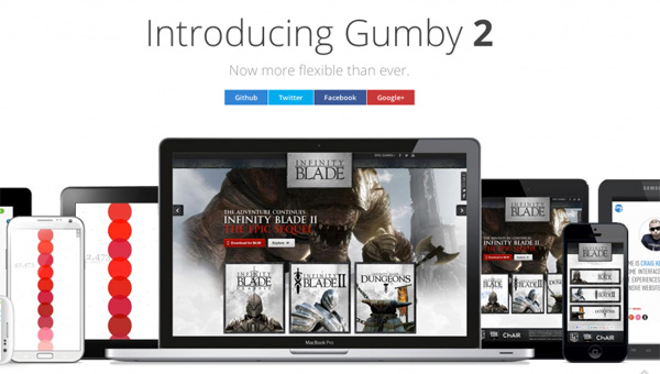
Gumby 2
Gumby 2 is an amazing responsive CSS Framework. It is built with the power of Sass. Sass is a powerful CSS preprocessor which allows us to develop Gumby itself with much more speed.
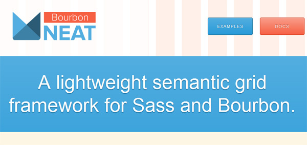
Bourbon Neat
Neat is an open source fluid grid framework built on top of Bourbon with the aim of being easy enough to use out of the box and flexible enough to customize down the road.
Ivory
Simple, Flexible, & Powerful responsive web framework, Makes your web development faster and easier.
Foundation
The most advanced responsive front-end framework in the world.

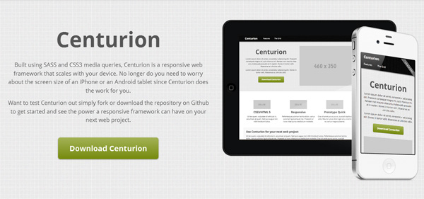
Centurion
Centurion is a responsive web framework that scales with your device. No longer do you need to worry about the screen size of an iPhone or an Android tablet since Centurion does the work for you.
Less Framework 4
Less Framework is a CSS grid system for designing adaptive websites. It contains 4 layouts and 3 sets of typography presets, all based on a single grid.

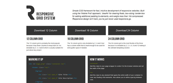
Responsive Grid System
Simple CSS framework for fast, intuitive development of responsive websites. Built using the ‘Mobile First’ approach, ‘clearfix’ for clearing floats, box-sizing: border-box for adding additional padding to elements, and weighs less then 1kb compressed.
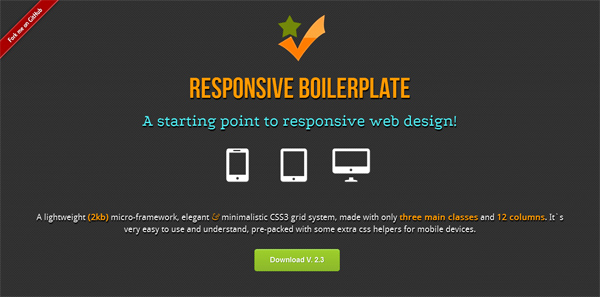
Responsive boilerplate
A lightweight (2kb) micro-framework, elegant & minimalistic CSS3 grid system, made with only three main classes and 12 columns.
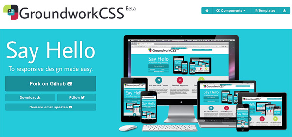
Groundwork
GroundworkCSS has been built from the ground up with the incredibly powerful CSS preprocessor, Sass. Sass is an extension of CSS3, adding nested rules, variables, mixins, selector inheritance, and more.

